The Process
When undertaking the redesign of CloudMondo's blazeX app, I led the team through a clear and structured methodology to achieve our goals:
- Clearly define the apps goals, capabilities, and audience
- Define where the current app falls shorts or hits pain points
- Research and explore competitors, ideation, and user engagement
- Synthesize research with new design direction and objectives
- Build high-fidelity prototypes and align with stakeholders
- Create wireframe with multiple review rounds and iterations
- Bring the wireframes to life with the new design, look and feel
- Work closely with engineering to implement and deploy
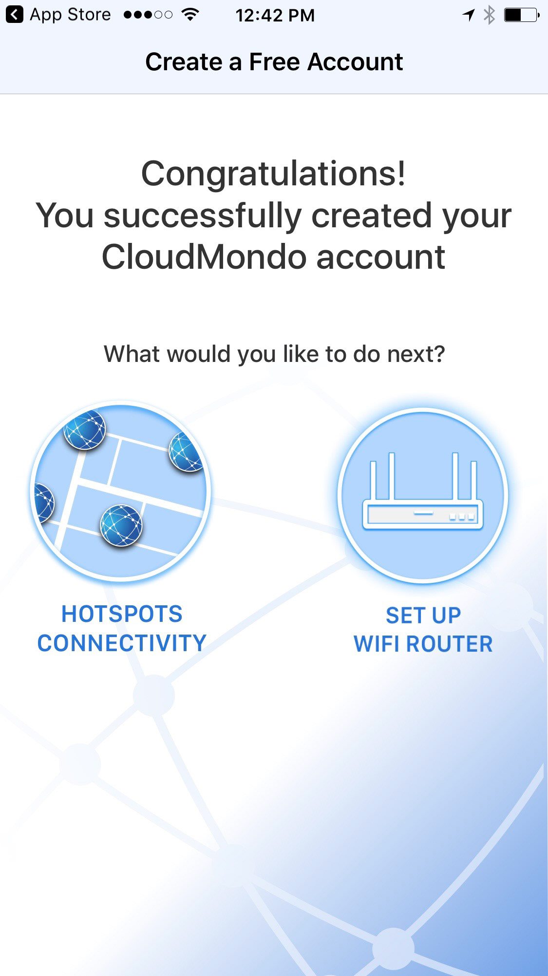
Assessing the App and Defining Pain Points
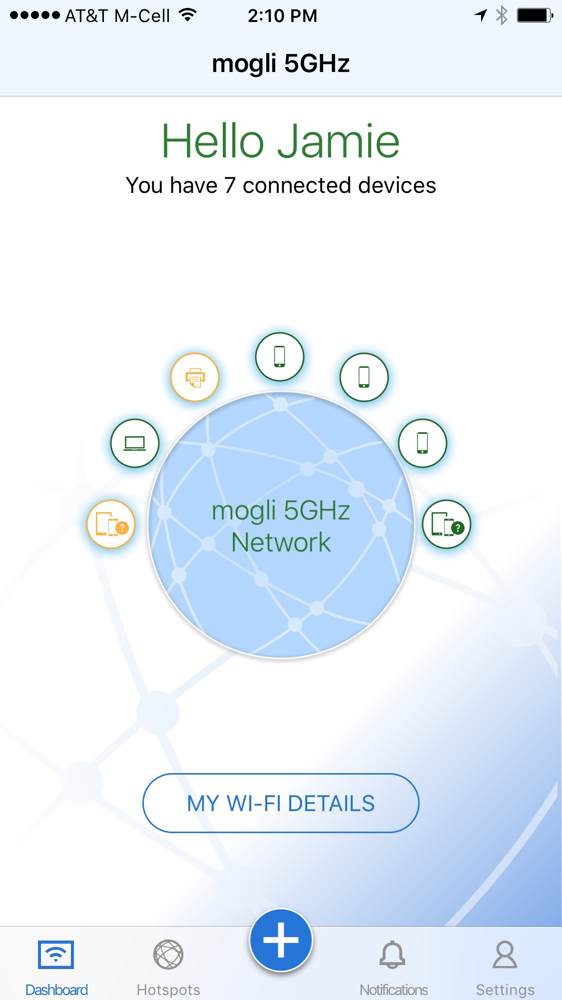
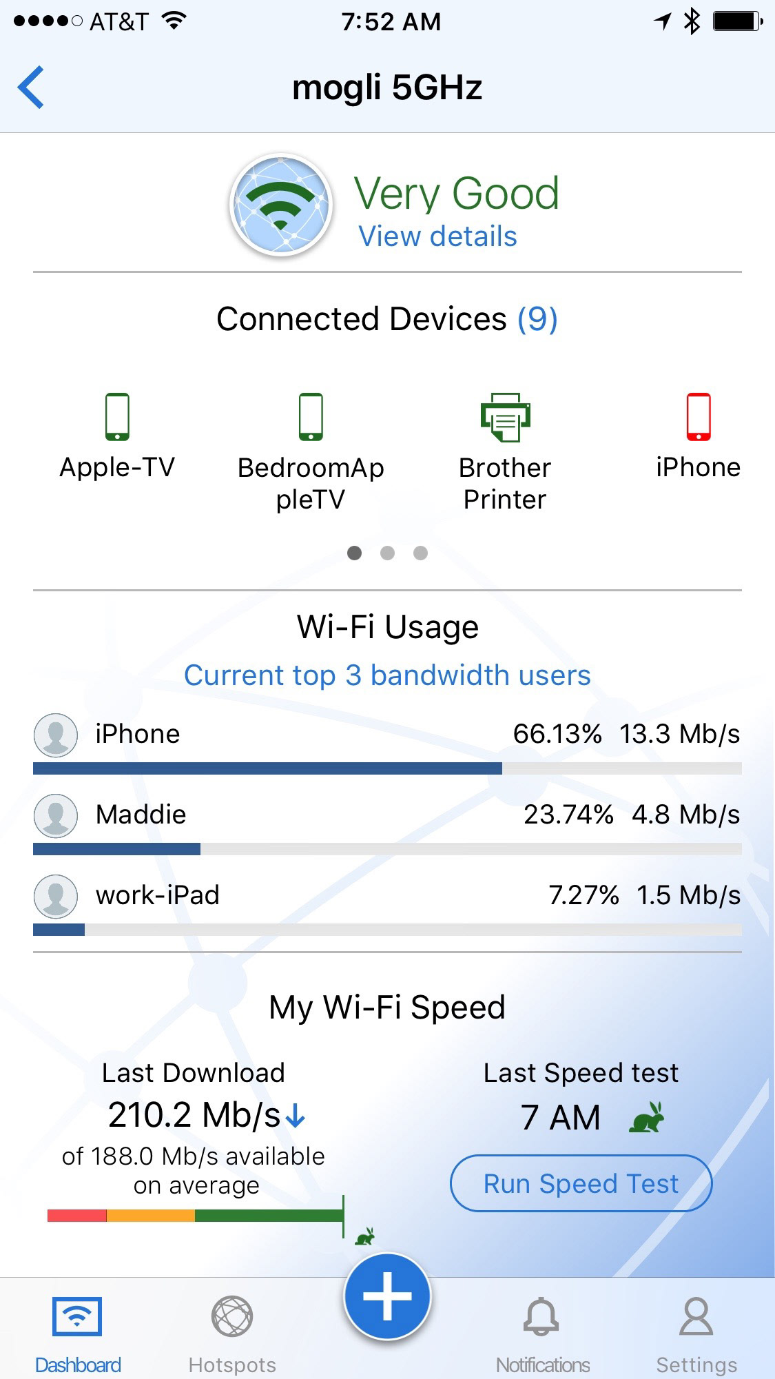
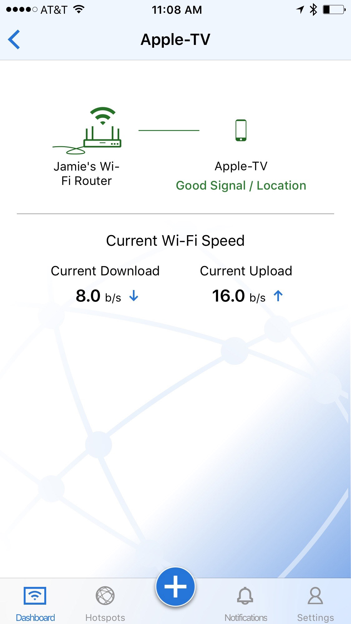
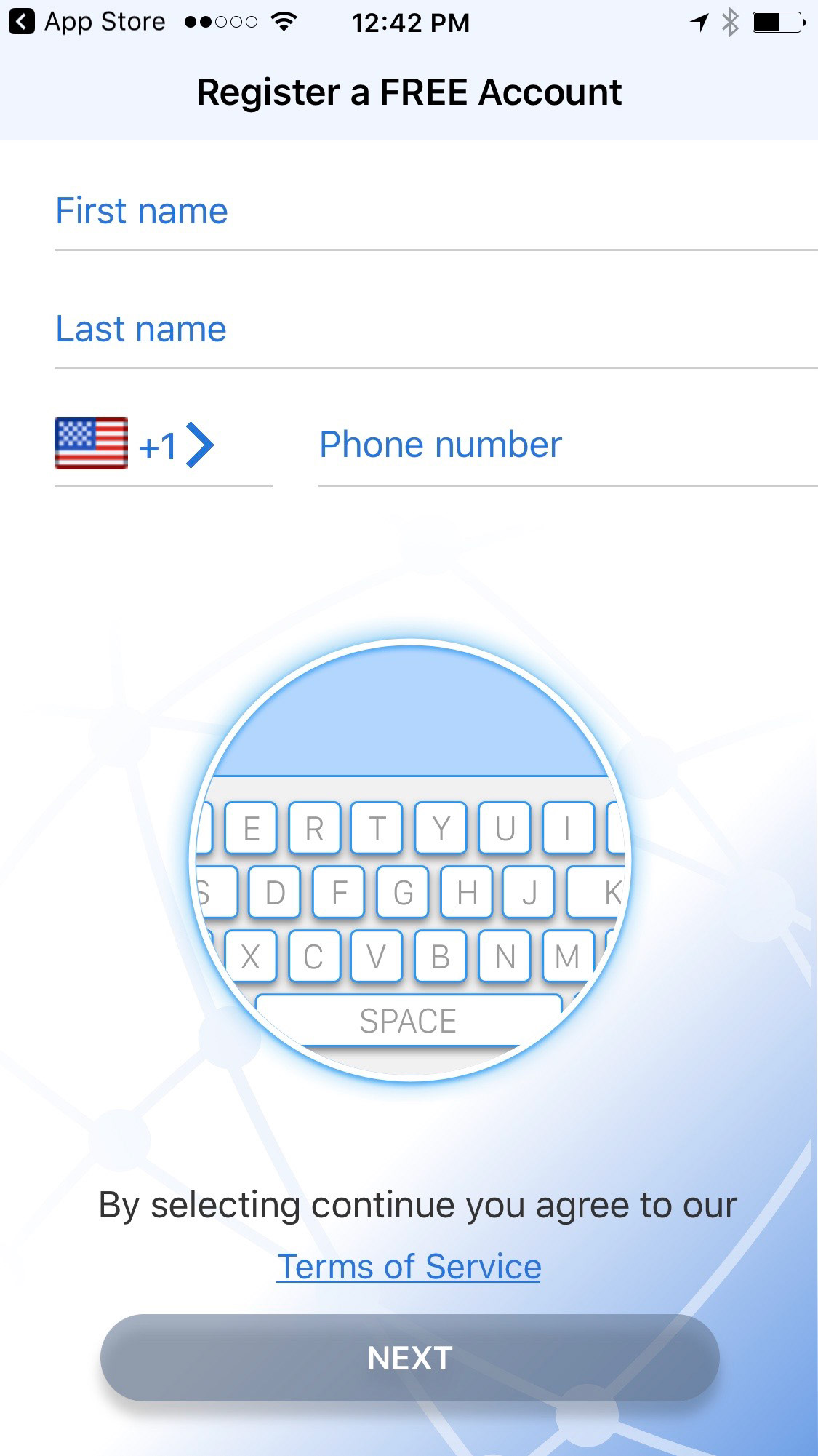
A thoughtful review of the current app highlighted many issues and pain points that indicated poor user-experience, lead to user abandonment, or degraded the overall experience interacting with the app including.
- The design was antiquated and didn't reflect the cutting-edge technology driving it
- It was hard to understand what the app did or how to access much of its power
- The iconography and typography was too small and hard to read
- There was little or no interaction that would engage the user
- Data and analytics were too technical and didn't make sense to most users
- The targeted audience was too limited and didn't provide for scaling
Brainstorming and Whiteboarding
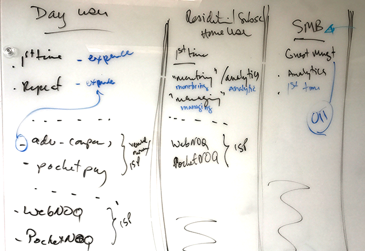
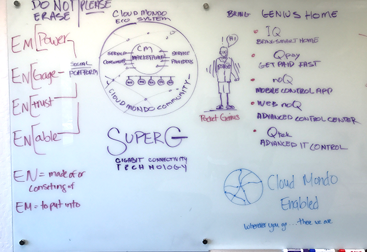
Brainstorming and white-boarding with my team allowed us to better understand our entire suite of apps, their goals and capabilities and use cases, clearly define and target our users and audiences, and gain a better understanding of the rich technology that drove the app. From these deep dive sessions, I was able to see a clear path forward for the redesign. Changing the Apps name from blazeX to IQ, we set our focus on crafting a new app that intuitively and effortlessly allowed users to manage and engage with their connected worlds. From residential users to SMB's and enterprise, this redesign needed to convey 'smart', 'intuitive', and 'effortless'.
Competitive Analysis
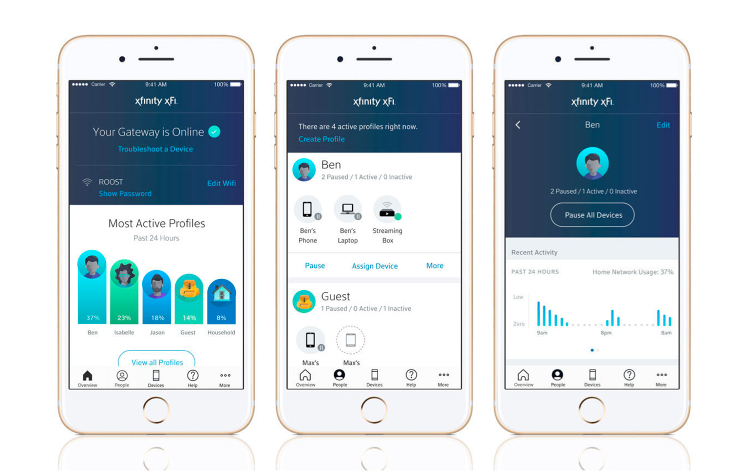
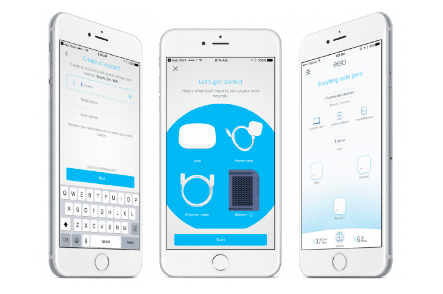
Working with my team and product management we did a thorough competitive market analysis looking at every Wi-Fi and network solutions products on the market to assess their capabilities, interactions, and user-experience, and uncover any pain points or missed opportunities. We looked at both current trends in the marketplace as well as technologies on the horizon. We read reviews, technical documents, and articles to elevate and hone our knowledge on Wi-Fi, connectivity, and networking. We downloaded and researched dozens of apps searching for new and innovative ways to scroll, tap, swipe, open, delete, and manage - understanding that each and every micro-interaction is a critical component of user-experience.
Wireframes and Iterations
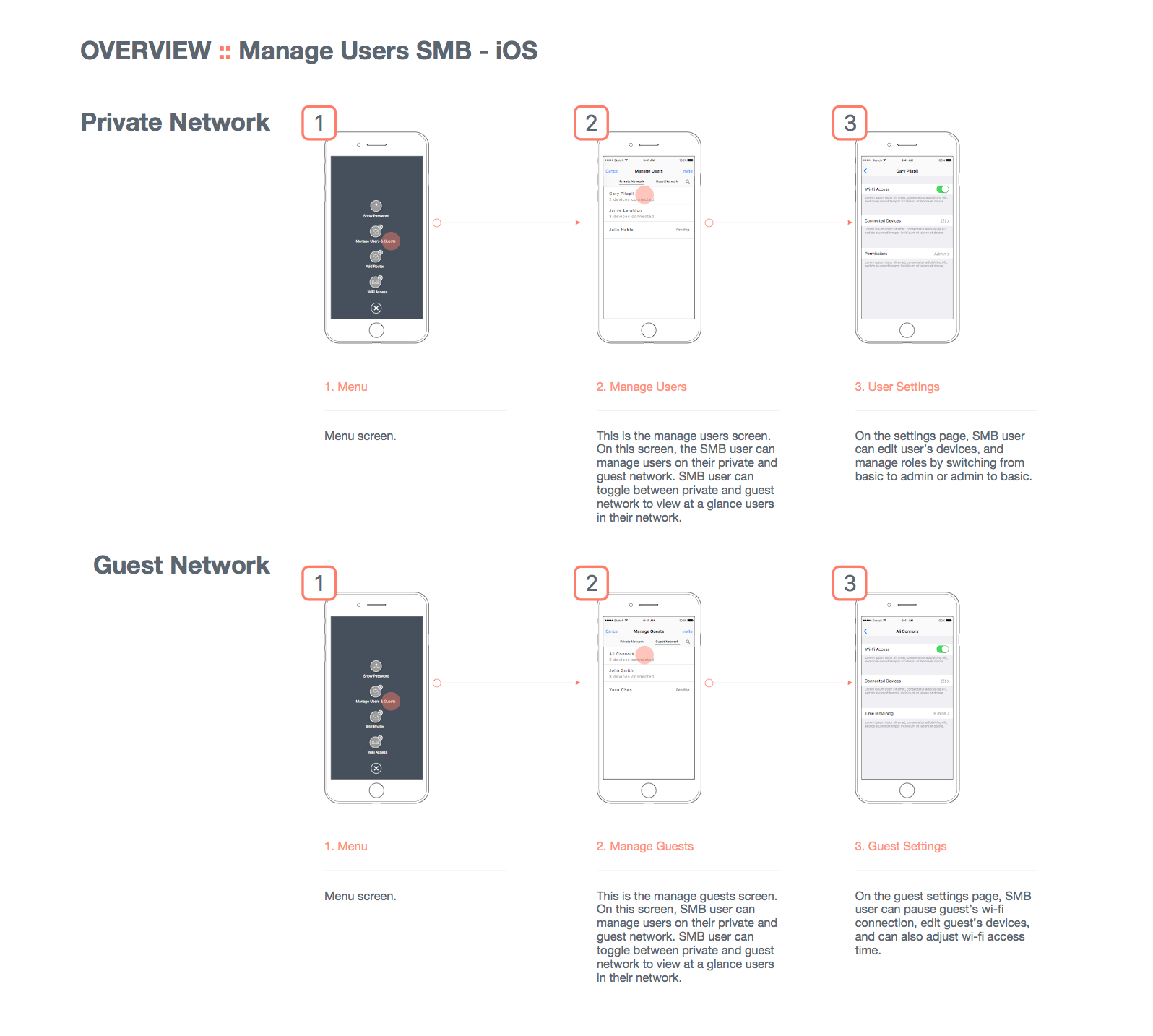
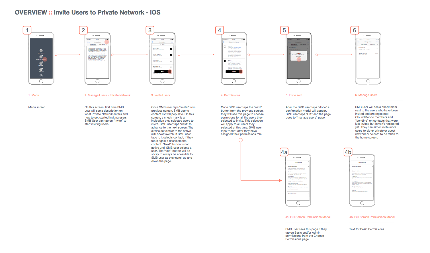
Working closely with my Senior UX team members we crafted dozens of wireframe iterations and user flows throughout our apps seeking the most intuitive and effortless pathways. From onboarding routers to inviting and managing friends, guests, and networks, or accessing rich data and analytics - we wireframed everything from happy paths to corner cases. We refined, rethought, and re-examined each flow, presenting to stakeholders, working with engineers, and testing with users outside of our groups until we had outlined the best possible user-experiences.
Prototypes and Mock-ups
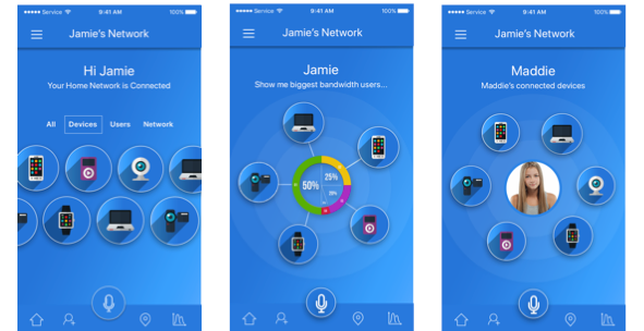
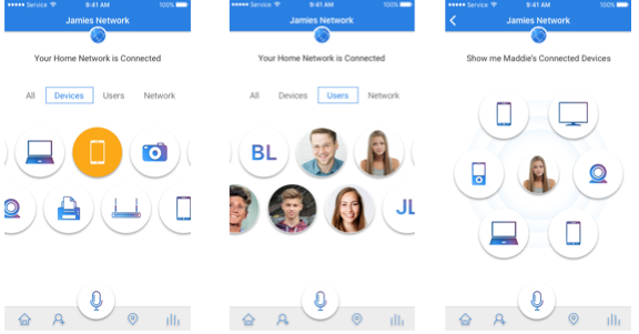
Ideating and collaborating with my entire UX team, we mocked-up dozens of possible design directions investigating gradients, skemorphic and 3D iconography, flat design, material design, micro-animations, gestures, and more. I presented ideas and designs weekly to groups of stakeholders including products managers, engineers, CTO's and CEO's until we arrived at the final designs.
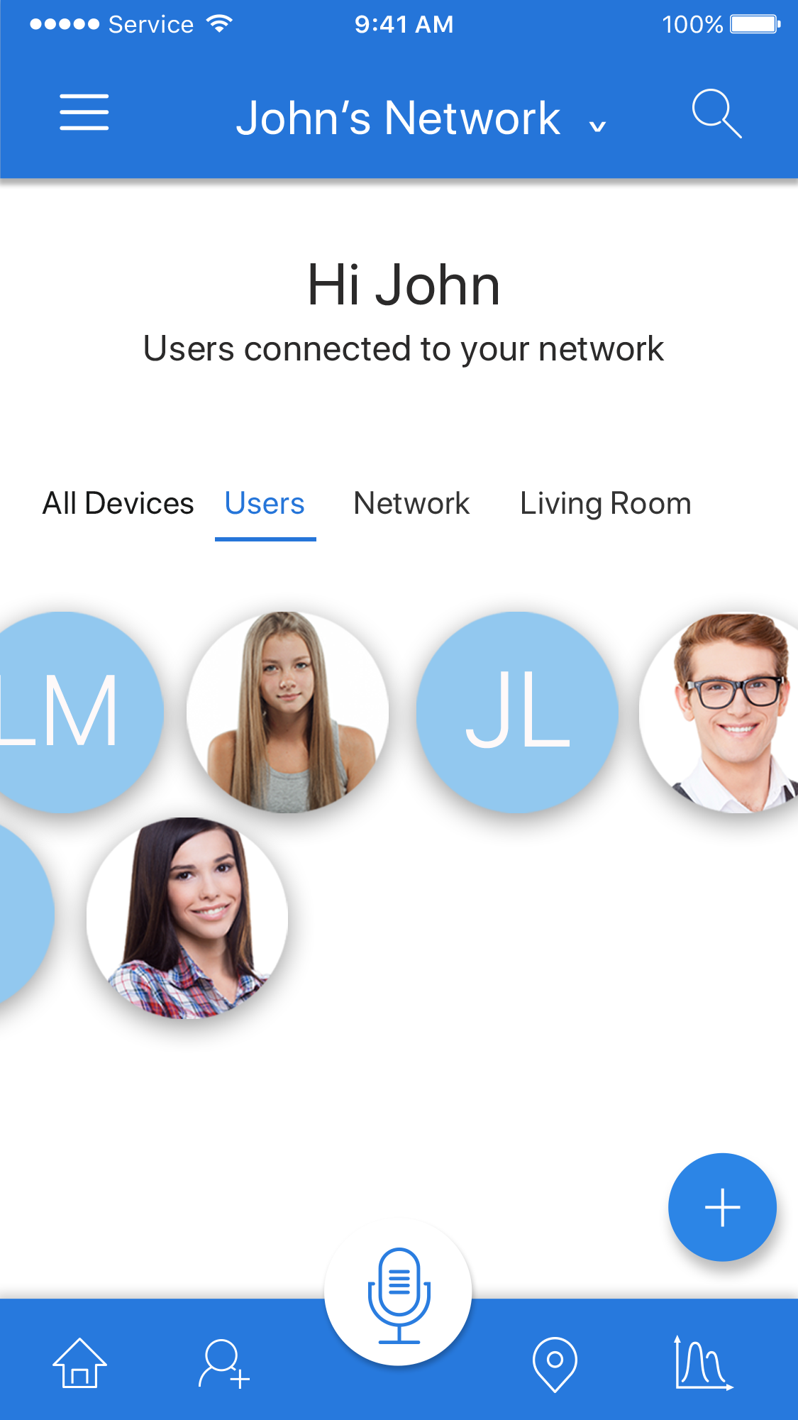
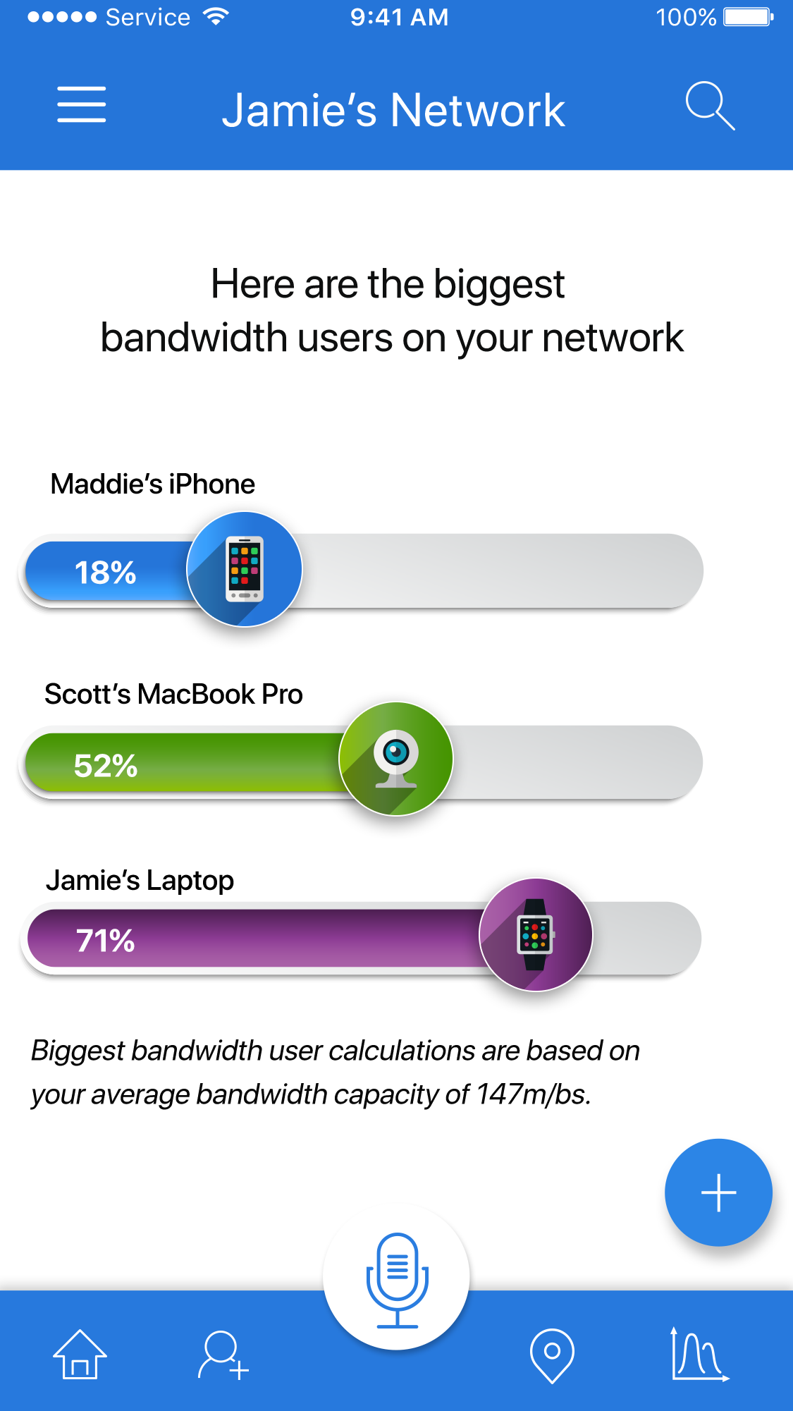
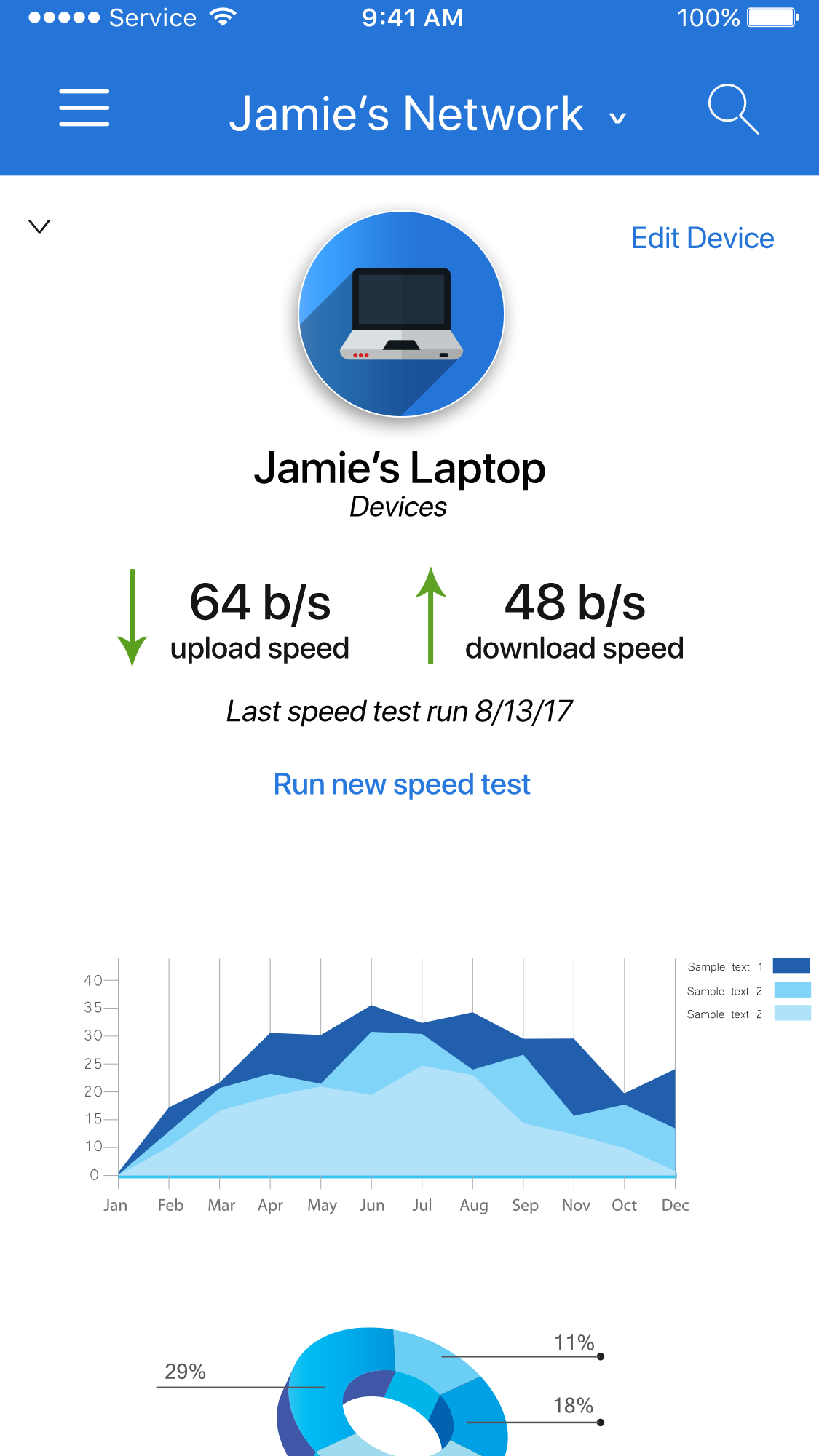
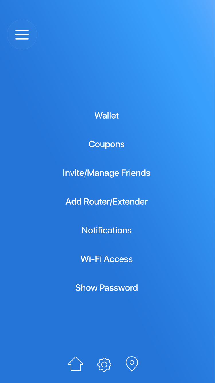
Meet IQ
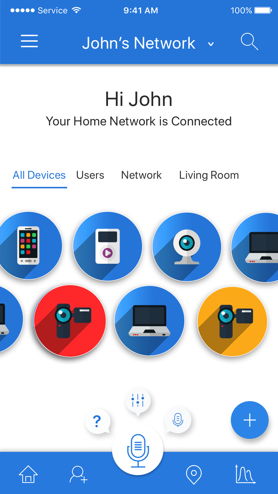
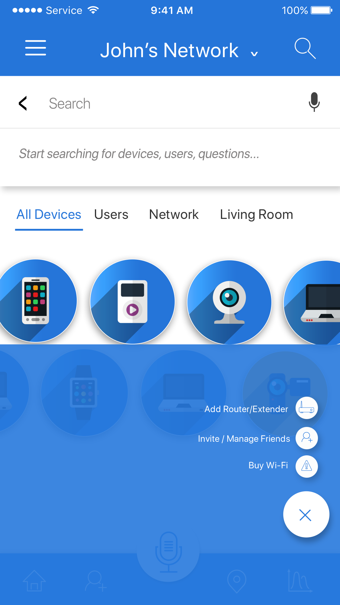
The final redesign begins to take shape. The new design is bright, interactive, engaging and easily navigated. Users are now able to manage their entire connected world from one place - easily identifying the health of their Wi-Fi and connected devices or users, see and manage their complete network, access IVR (voice recognition) to get their questions answered quickly, access parental controls, view analytics, run speed tests, and so much more more. From a single dashboard to a fully connected world.