In anticipation of the 2020 Tokyo Olympics, JTB, (Japan's largest travel agency and the 2nd largest travel agency in Asia), was seeking to overhaul their user's online experience, and the way people engaged with their website and brand throughout Asia, North America, and beyond.
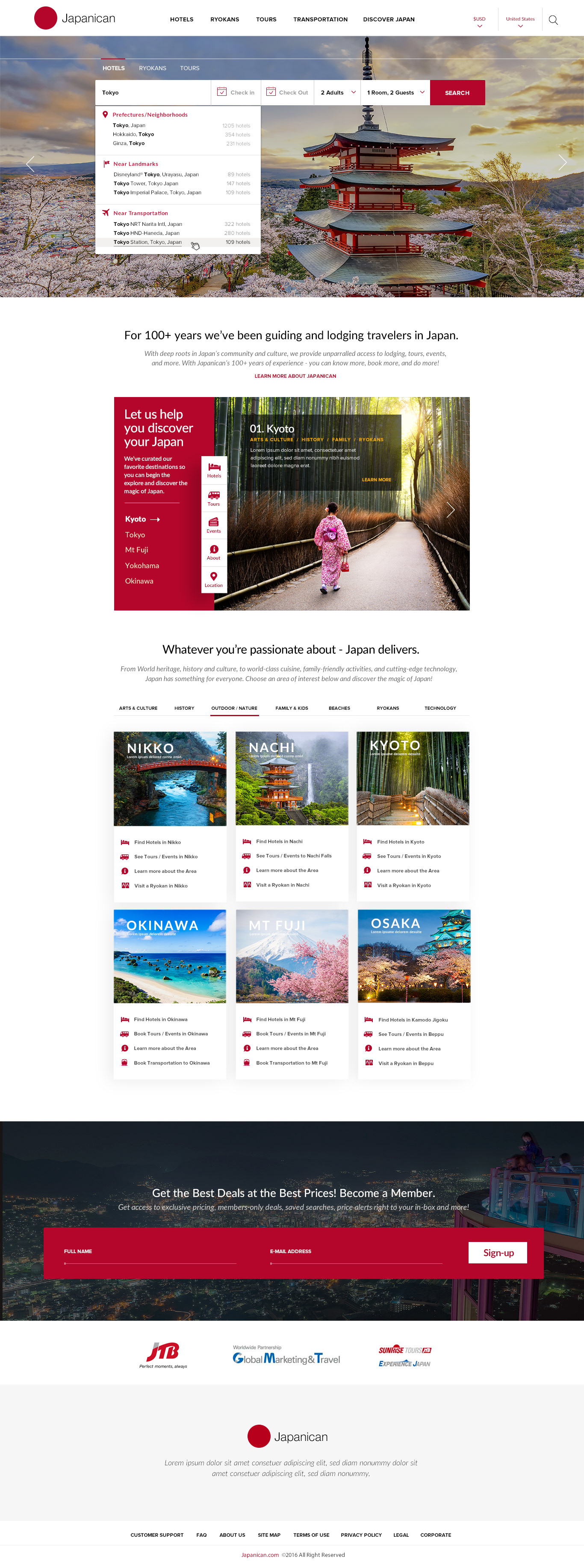
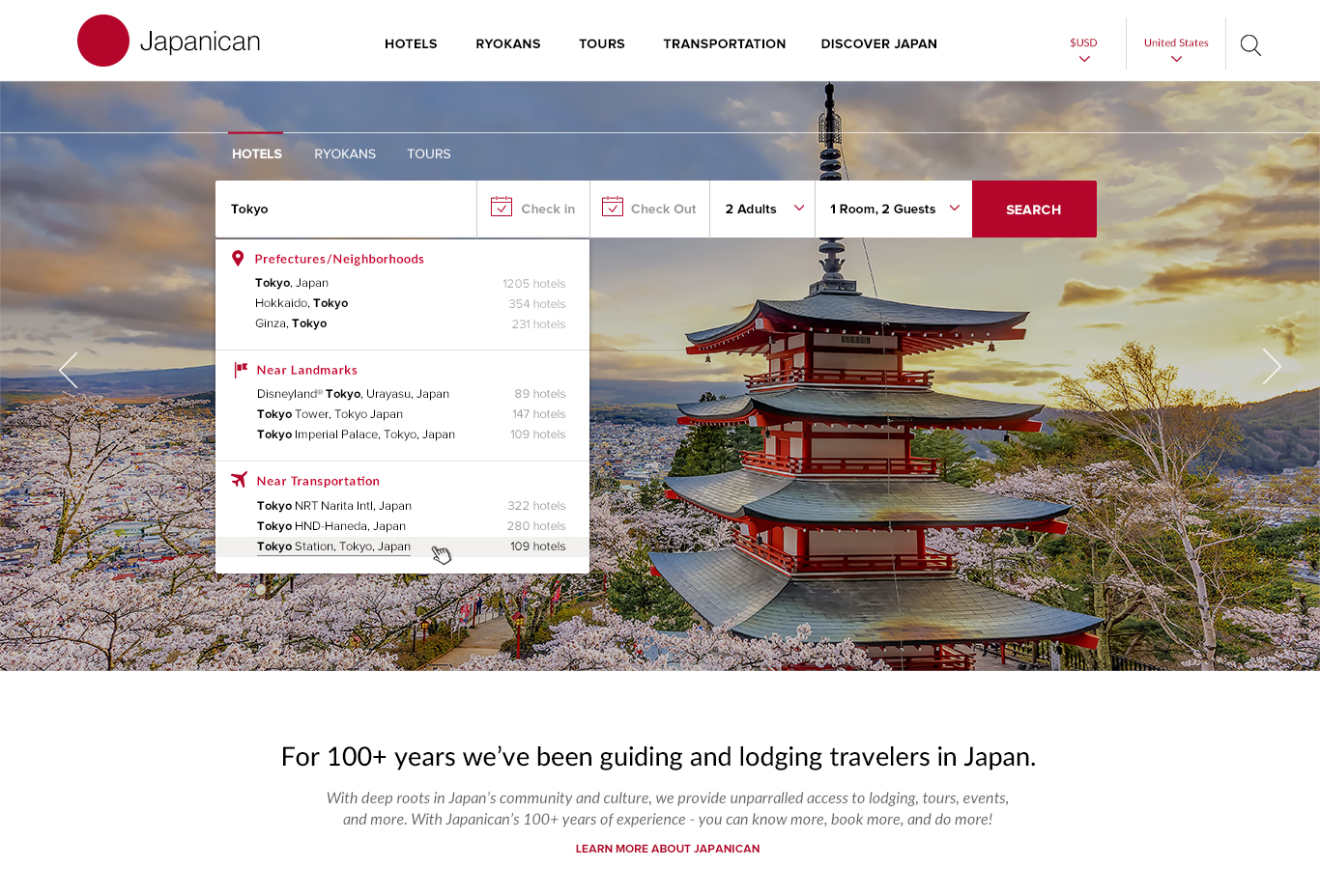
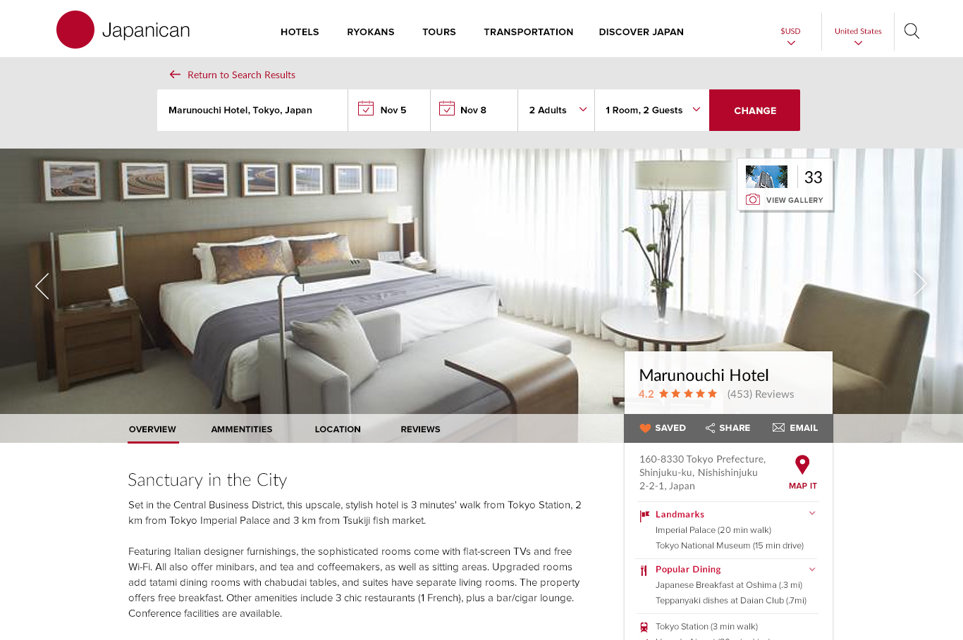
The new Japanican.com after the redesign
Hired as a consulting UX Director and the person who would build and lead a cross-continental team of creatives, designers, data scientists and technologists, my first task was a deep dive evaluation of the companies main online travel site and establish a baseline of traffic, user-engagement, conversion rates, competitors, and more.
Defining the Issues
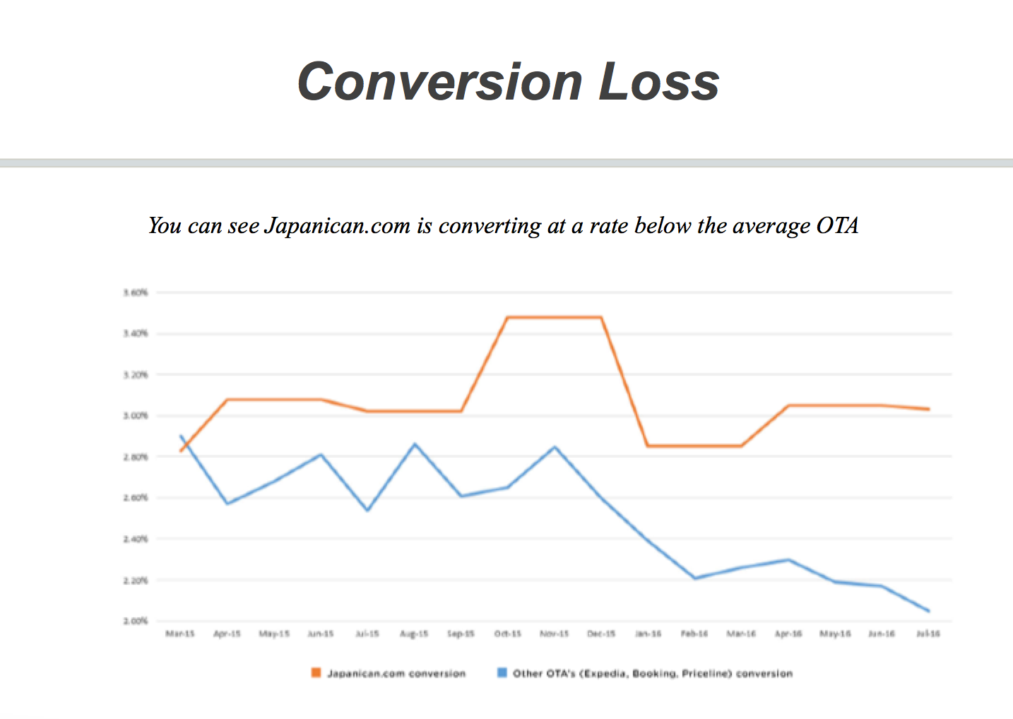
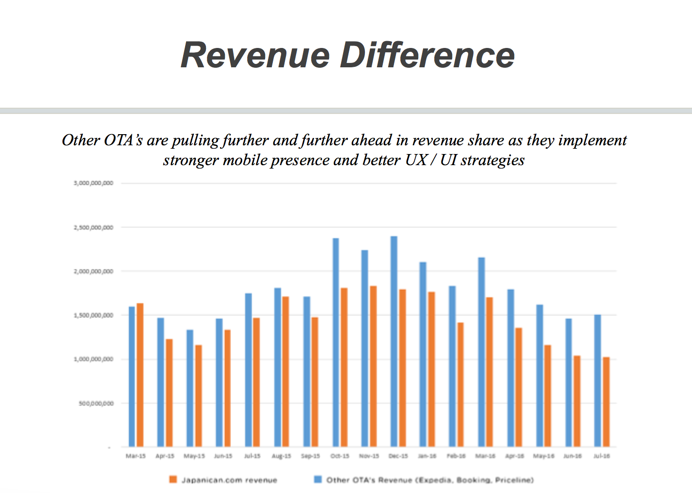
Spending more than 3 months working closely with Google analysts, data scientists, finance and revenue experts, and technologists, and drafting hundreds of pages across dozens of reports, we established that the company was leaving a staggering ¥11 Billion in potential desktop and mobile revenue on the table. We earmarked three major reasons for the losses.
1. Ineffective UX and Design
- Search capabilities broken or ineffective
- Average time onsite to complete a transaction was excessive
- Users cannot locate or access content quickly or easily
- GA is not being used effectively to measure, track or change poor performance
- Users cannot properly filter options to access the content they want
- Design does not meet basic global standards
- Poor prioritization or focus for Calls to Action
- Content and messaging is translating incorrectly and/or ineffectively
2. Mobile Traffic Diversions
- 50% of user traffic being diverted to ineffective mobile site
- Mobile site is non-responsive
- Mobile experience is not optimized - just cut and paste from website
- Mobile experience is slow and cumbersome
- Mobile is converting at the lowest rate in the industry
- Mobile site is non-responsive
- Mobile experience is not optimized - just cut and paste from website
- Mobile experience is slow and cumbersome
- Mobile is converting at the lowest rate in the industry
3. Underperforming Marketing
In reviewing the GA we found dozens of reasons pages were either underperforming or not performing at all.
- Ads linking to pages that no longer exist
- Incorrect targeting of audiences
- Retargeting of advertisements is unfocused
- Special campaign landing pages do not convert to sales
- Ads have words misspelled or words improperly translated
- Ads linking to pages that no longer exist
- Incorrect targeting of audiences
- Retargeting of advertisements is unfocused
- Special campaign landing pages do not convert to sales
- Ads have words misspelled or words improperly translated
All of these errors were the result of 3 main contributors:
- Poor design and content writing
- Improper translations
- Mismanaged Google and Facebook ad campaigns
- Poor design and content writing
- Improper translations
- Mismanaged Google and Facebook ad campaigns
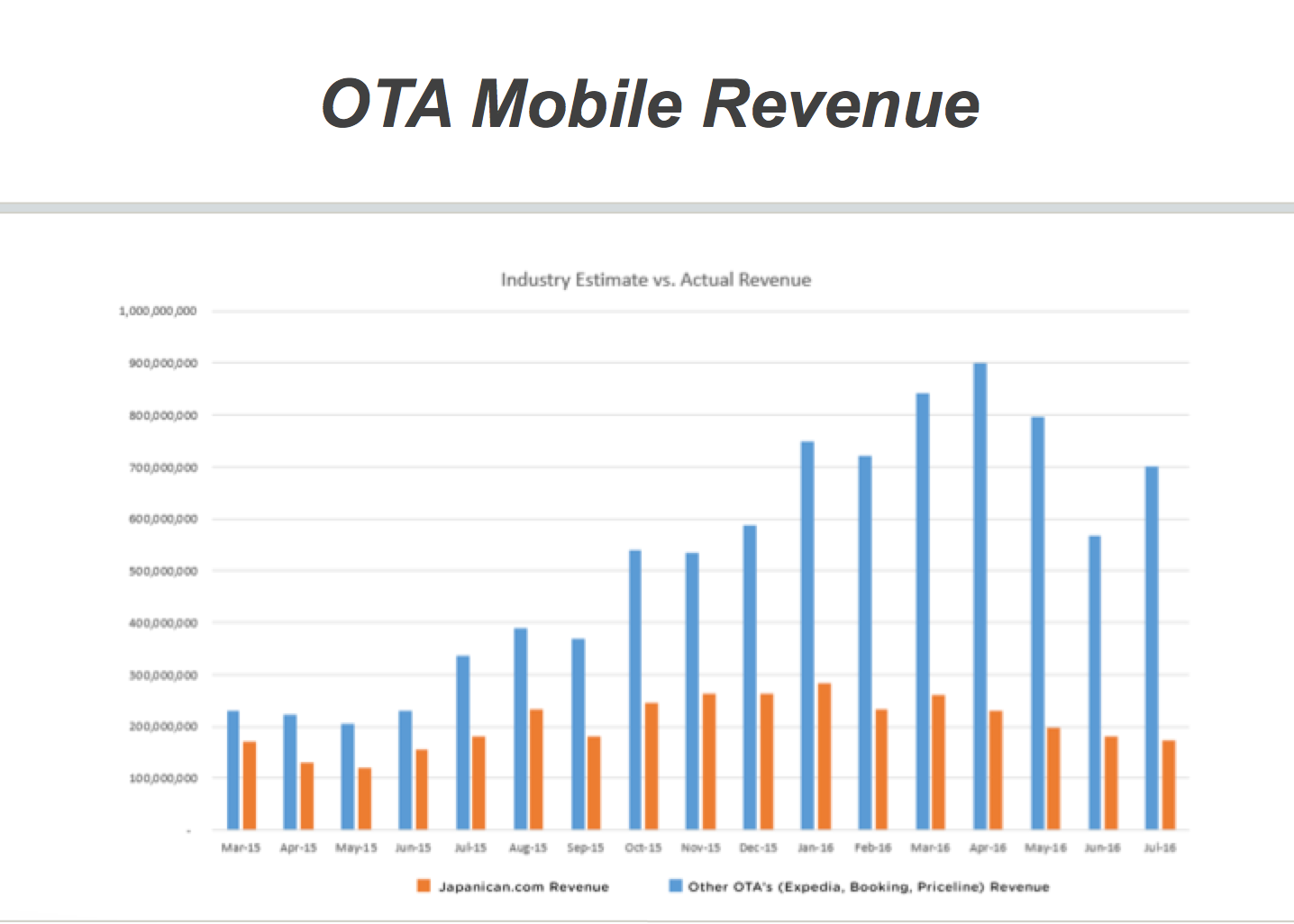
Our research showed a staggering ¥11 Billion in revenue loss due to bad UX
Competitive Analysis
Further investigating the global OTA market, we looked at all 5 major OTA companies, (Priceline, Travelocity, Booking.com, TripAdvisor, and Agoda), and researched their strategies, audience share, revenues, and user-experience and generated detailed reports. Our efforts concluded two major findings:
1. All major OTA's were using highly evolved UX methods
2. All other major OTA's were showing year over year increases in their revenue
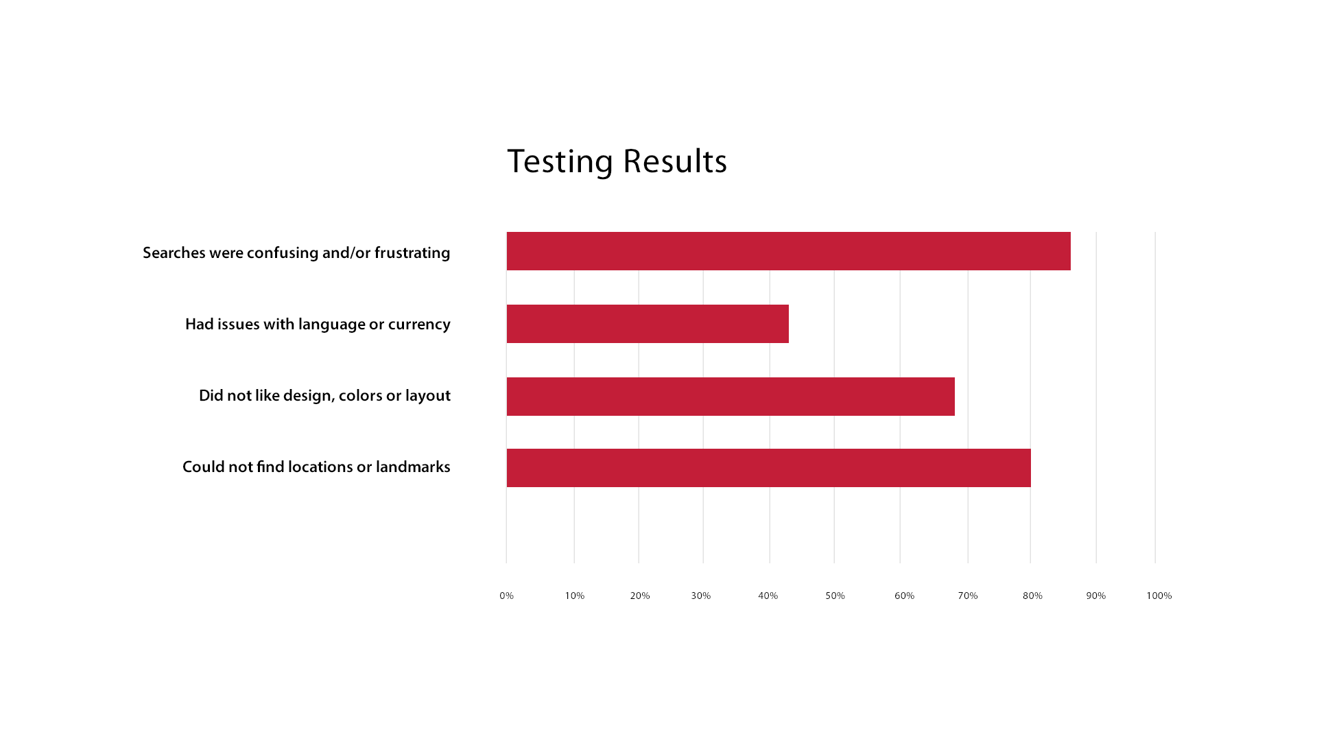
User Experience Testing
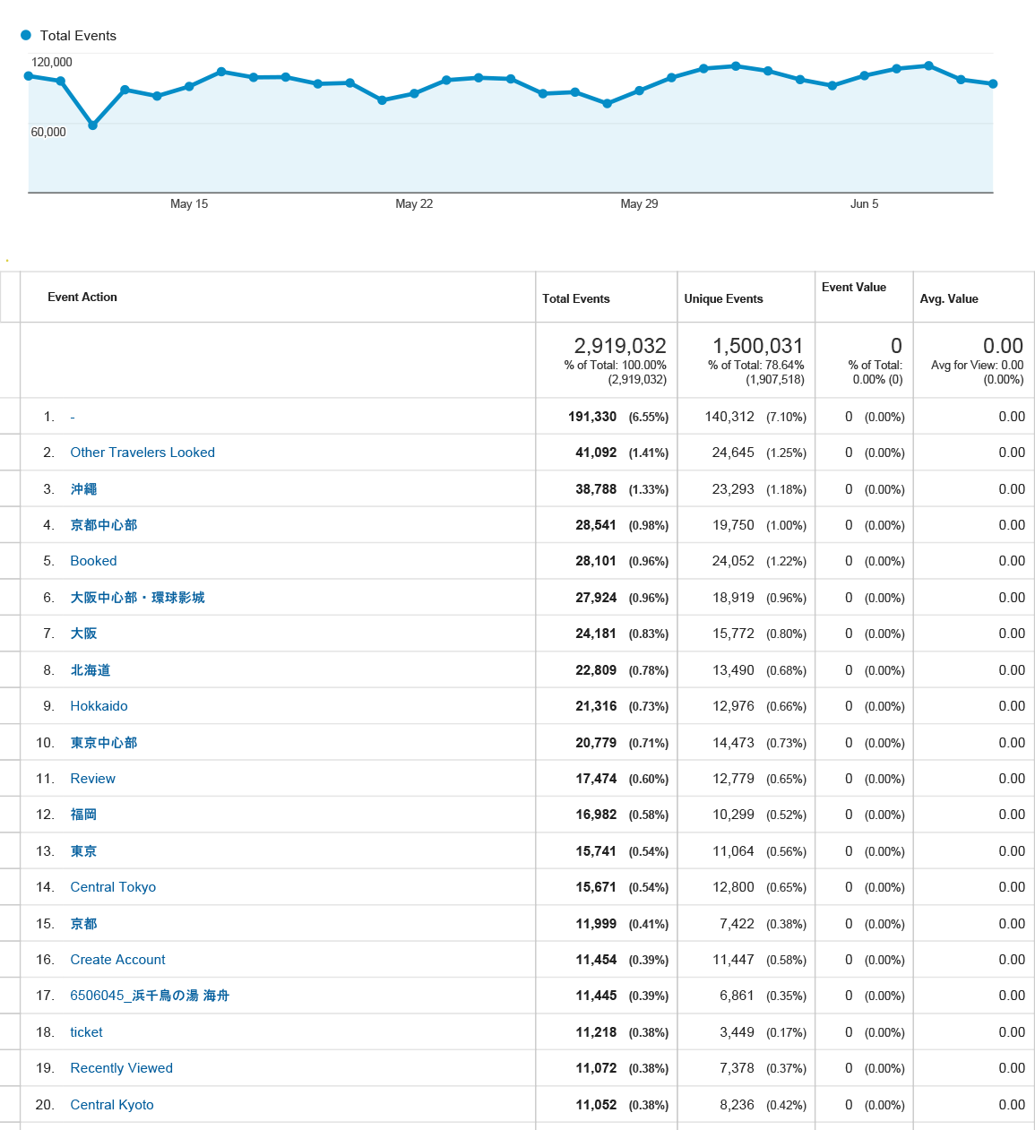
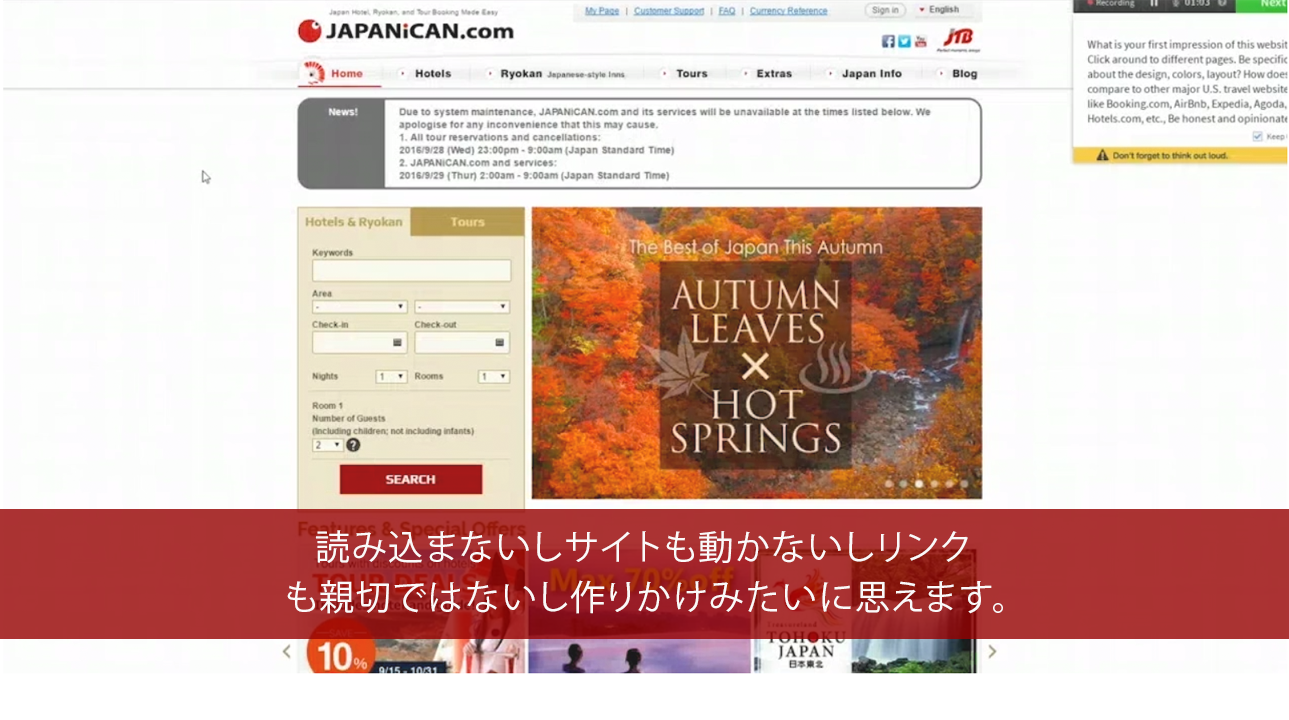
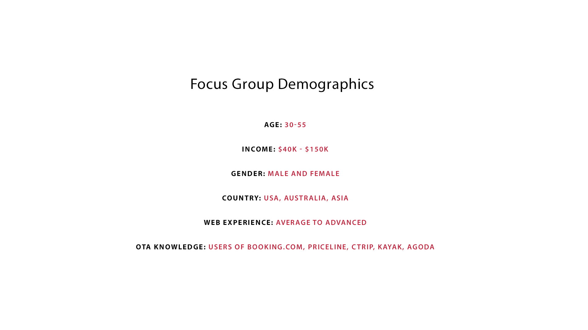
We additionally ran live and video-testing across a large demographic in core markets including North America and China and were able to define specific areas of confusion and pain points for users of our website.
Main User areas of Pain Points
- Confusing search functionality
- Language and currency translation issues
- Design unappealing and layout confusing
- Could not locate locations, landmarks or hotels easily
- Lacked experience or knowledge about Japan
- How to book unclear
- Confusing search functionality
- Language and currency translation issues
- Design unappealing and layout confusing
- Could not locate locations, landmarks or hotels easily
- Lacked experience or knowledge about Japan
- How to book unclear
Road Mapping the UX / UI Overhaul
Drawing from all areas of our research including Google analytics, financials, competitive analysis, and user testing, we prepared a 'next steps' recommendation report that addressed the 5 UX touch points we wanted to affect.
1. Brand Awareness
2. Information Architecture
3. Education and Knowledge of Japan
4. Inspire and Enage
5. Convert
2. Information Architecture
3. Education and Knowledge of Japan
4. Inspire and Enage
5. Convert

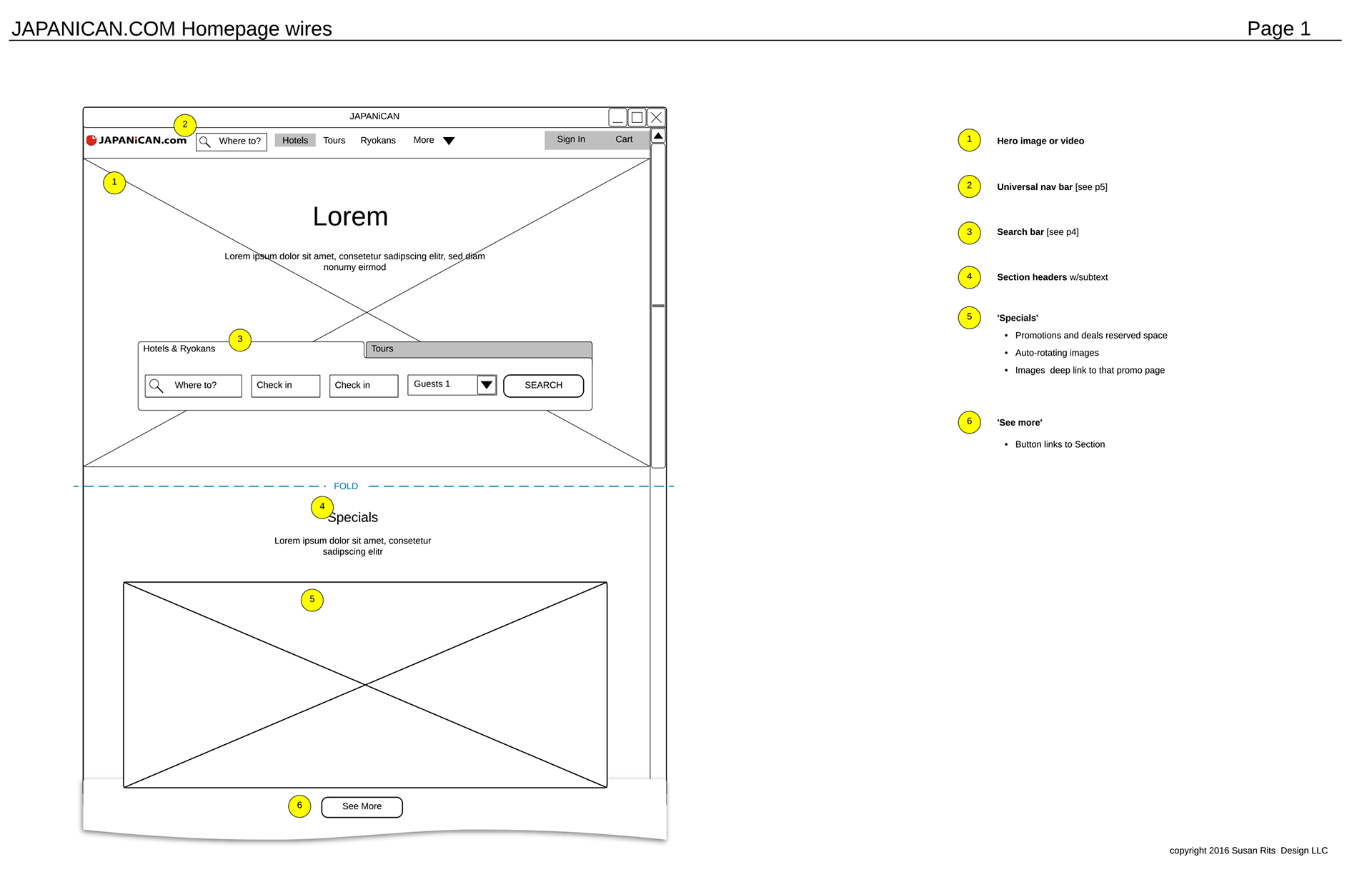
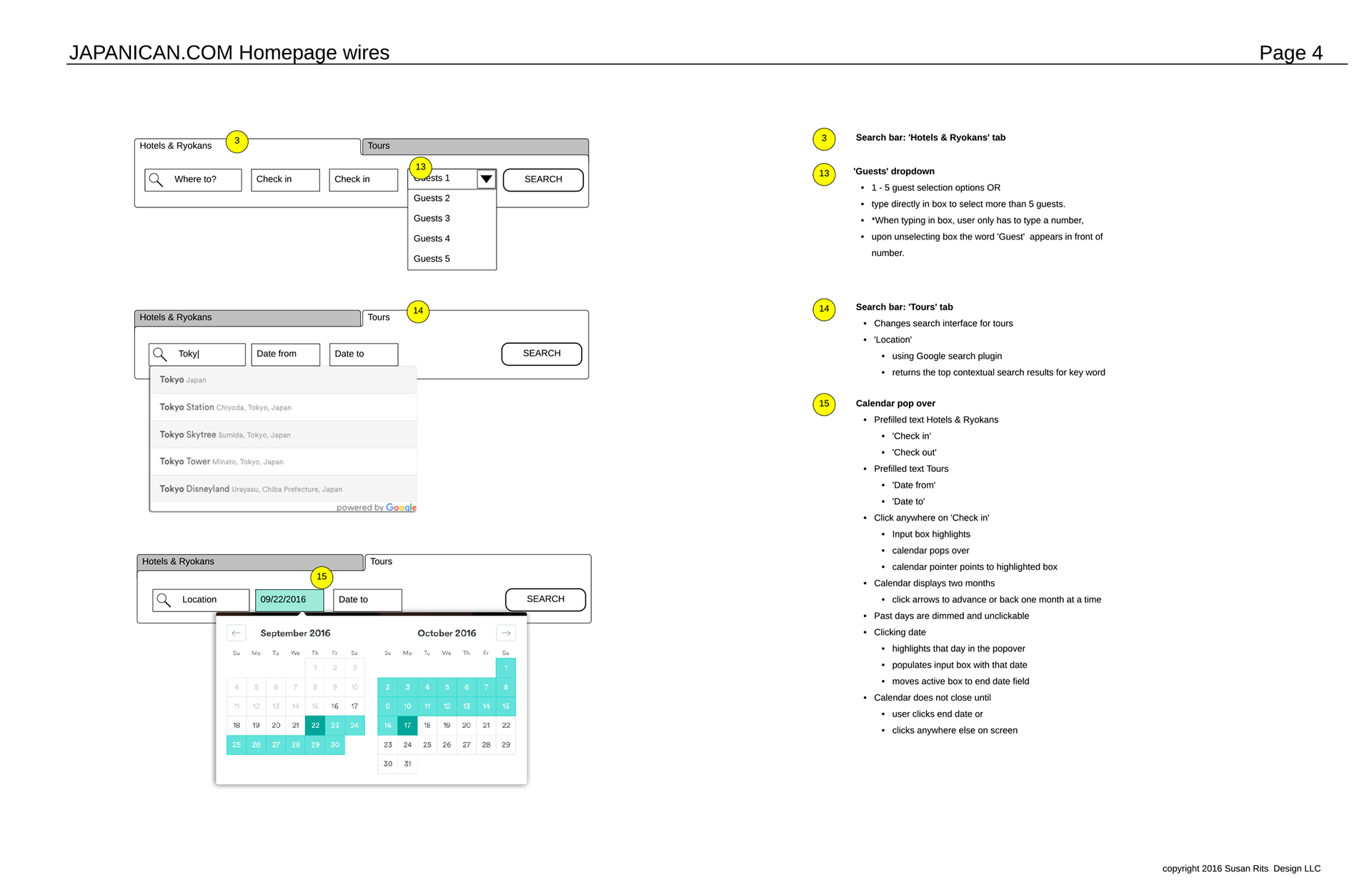
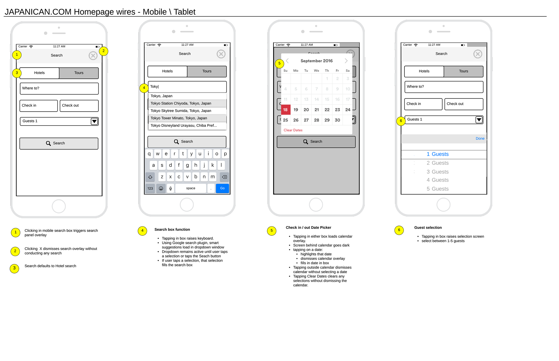
Wireframing and User Flows
Creating high level wireframes that would define the new architecture and user flows helped us organize content in logistical ways and see how users might access the content via web and mobile. We created dozens of these wireframes across every section of the website, revising, testing and reorganizing each new iteration.
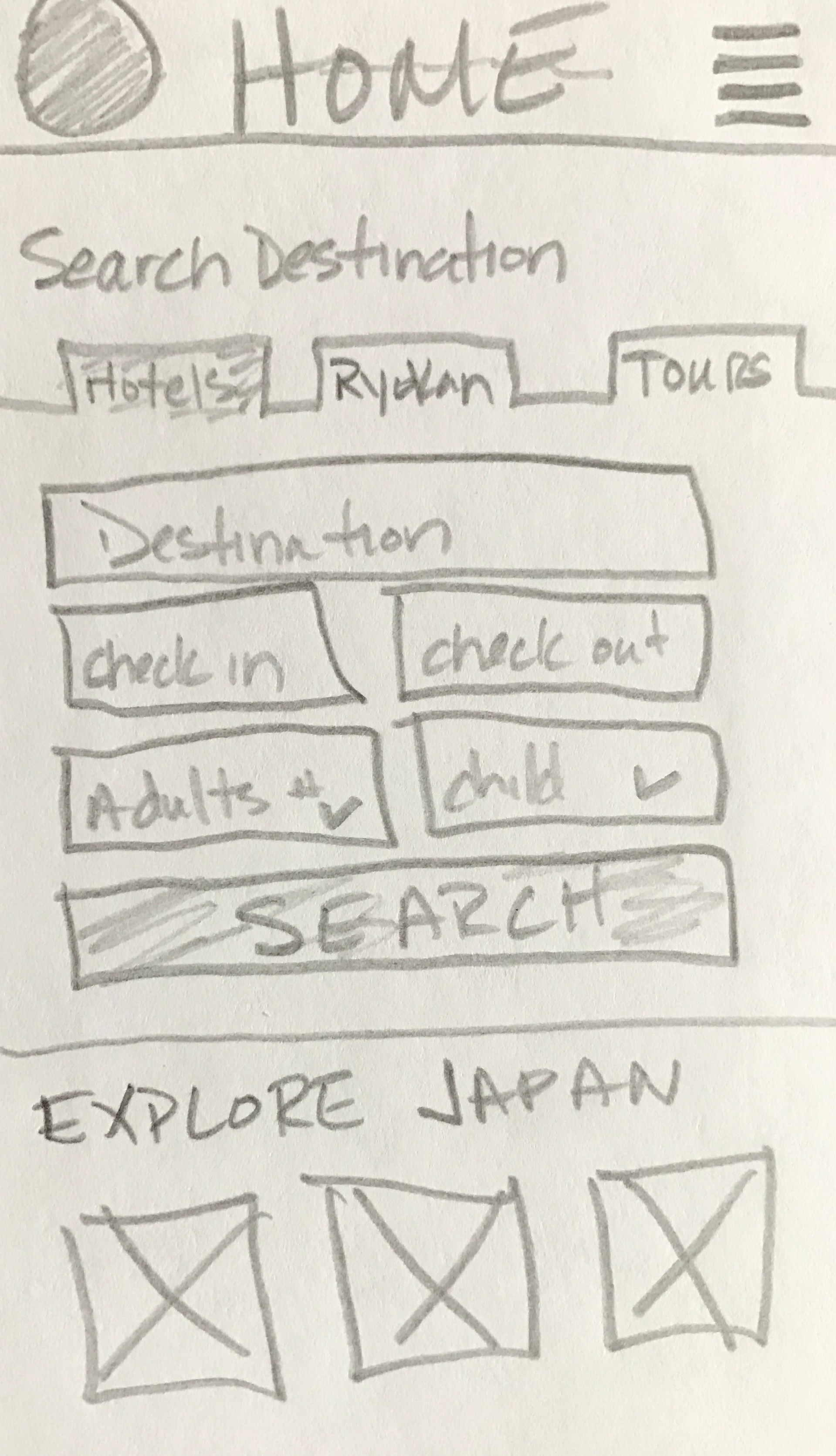
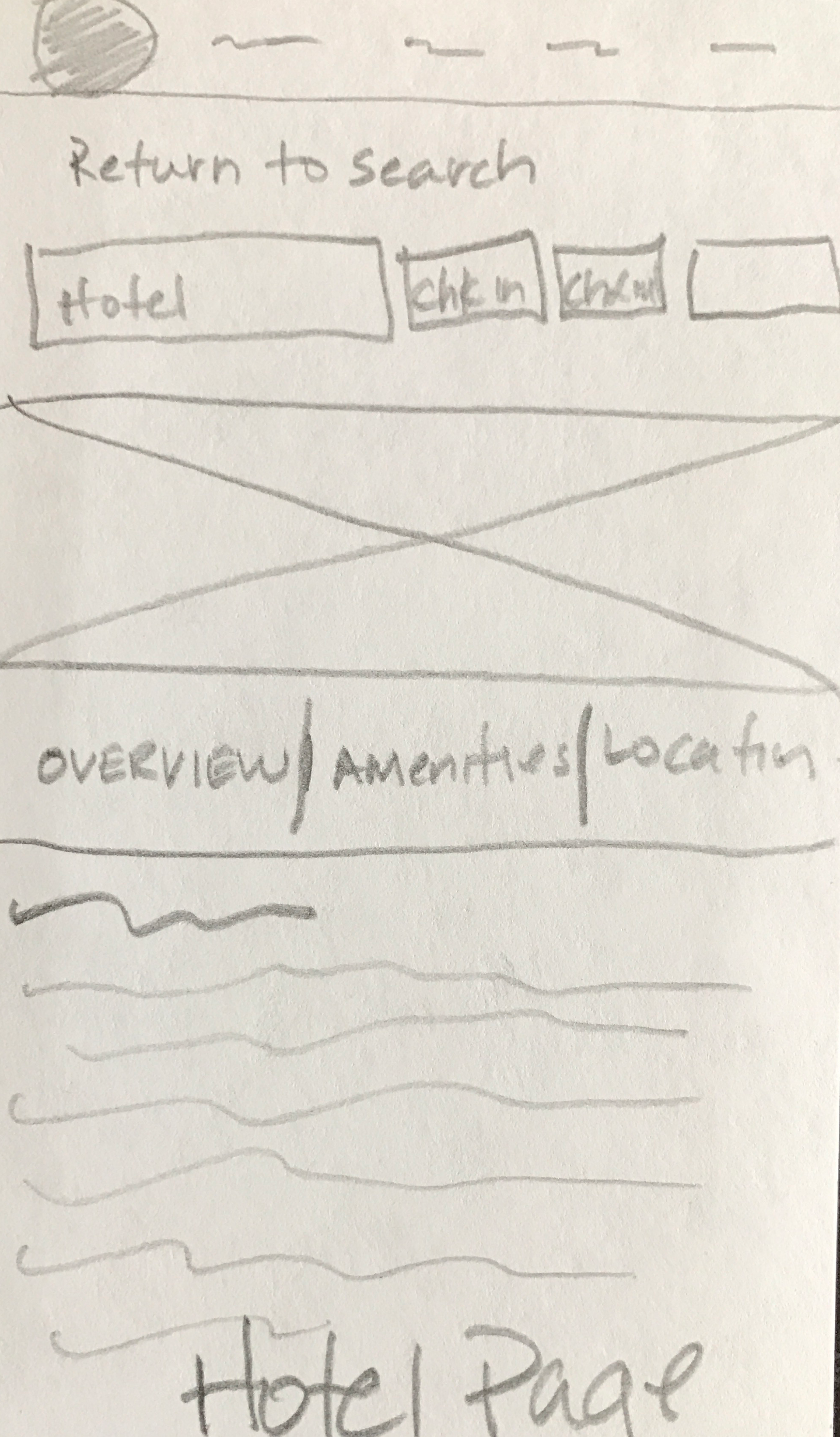
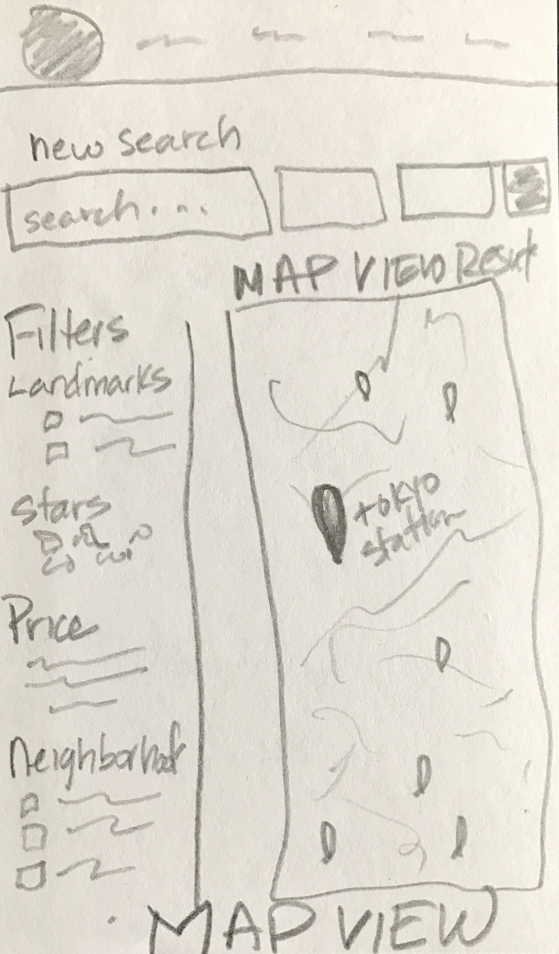
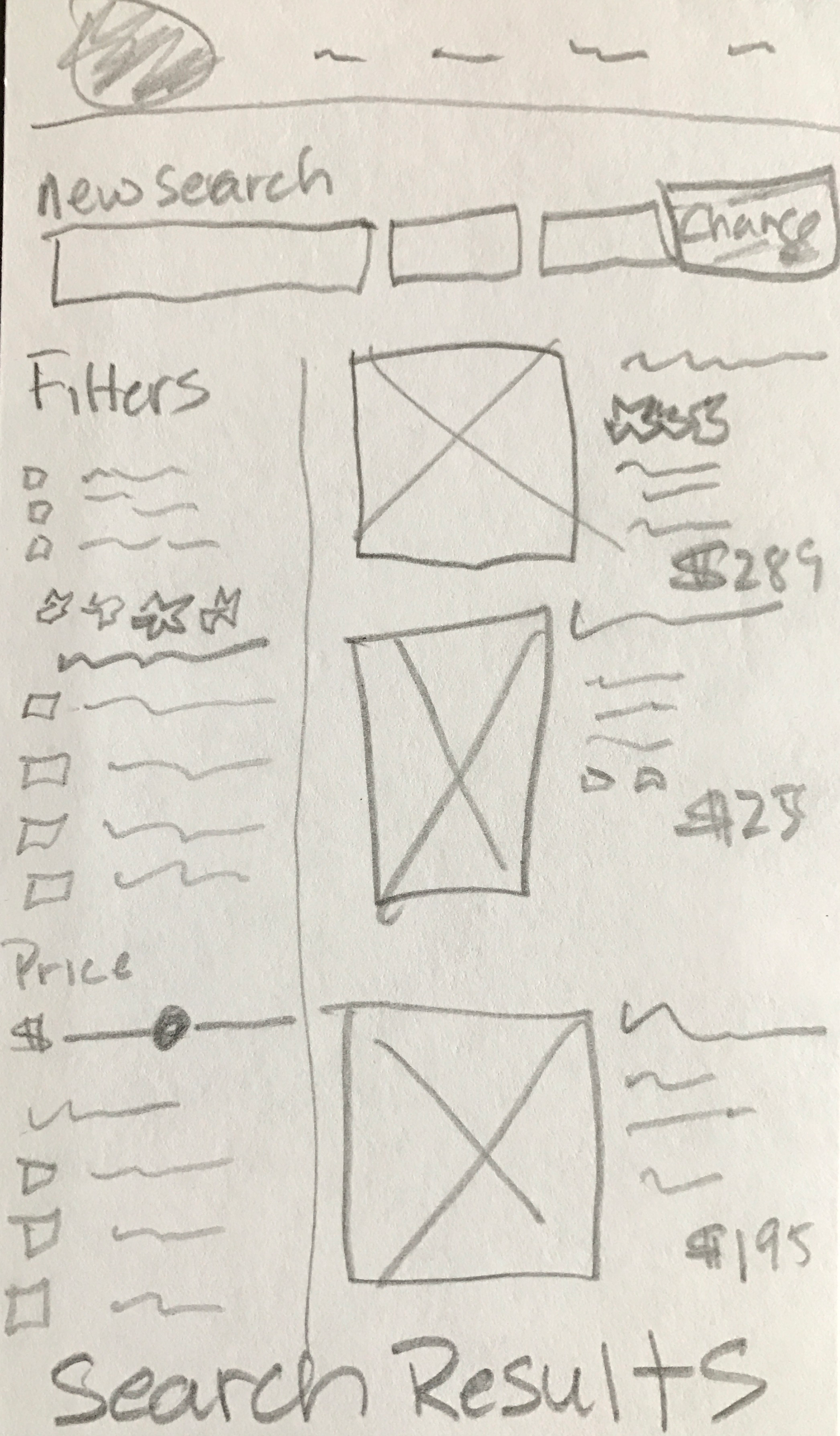
Low fidelity sketches and doodles begin for the new wesite
Rough sketches and low fidelity doodles allow me to see quick renditions and possible ways to organize content. A few days were dedicated to this process of sketching, refining, tossing out, more sketching and more refining until we got close to where we wanted to end up with the flow.
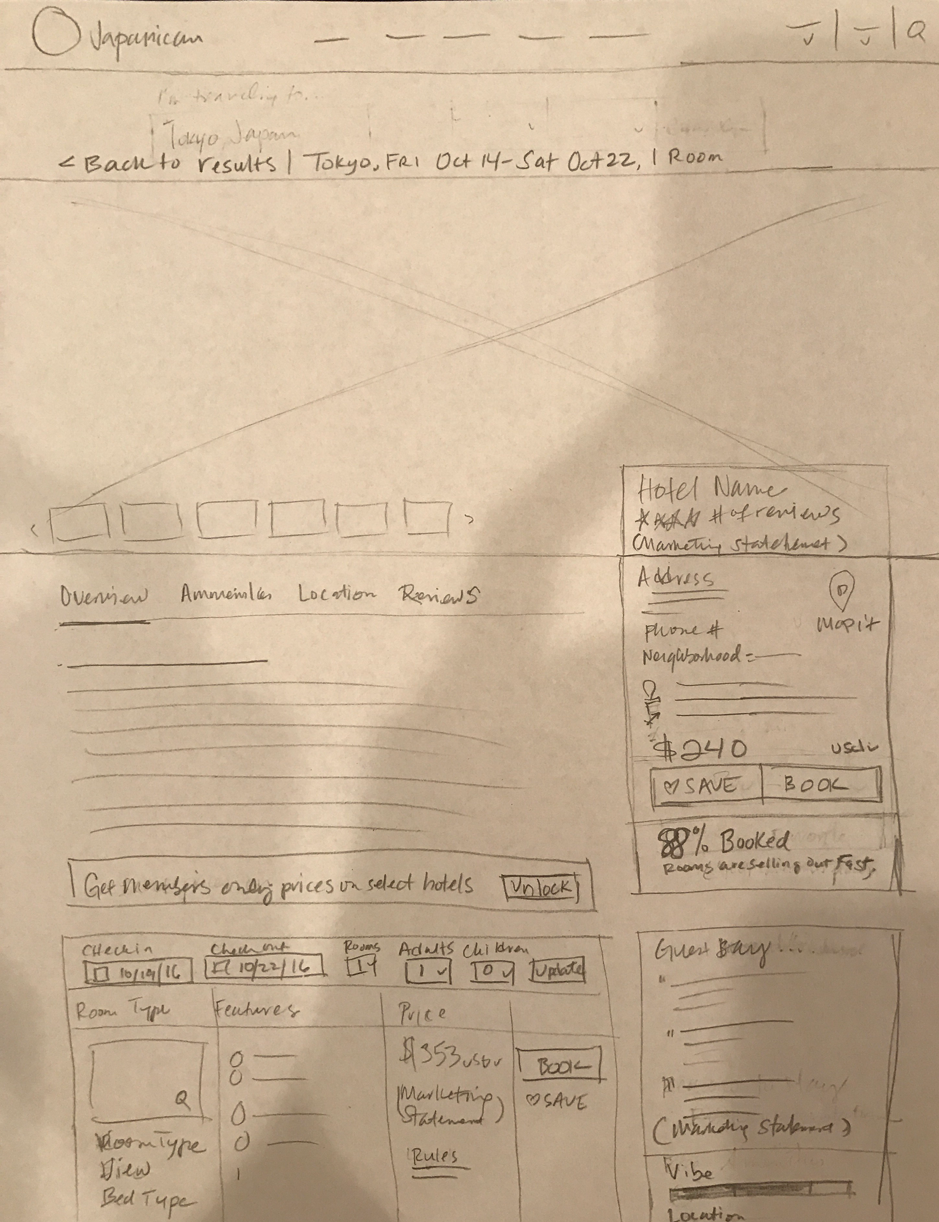
High Fidelity Prototypes get Underway
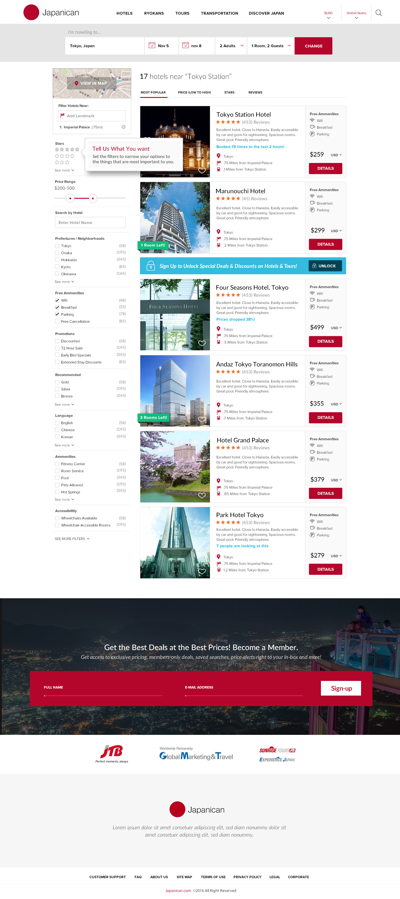
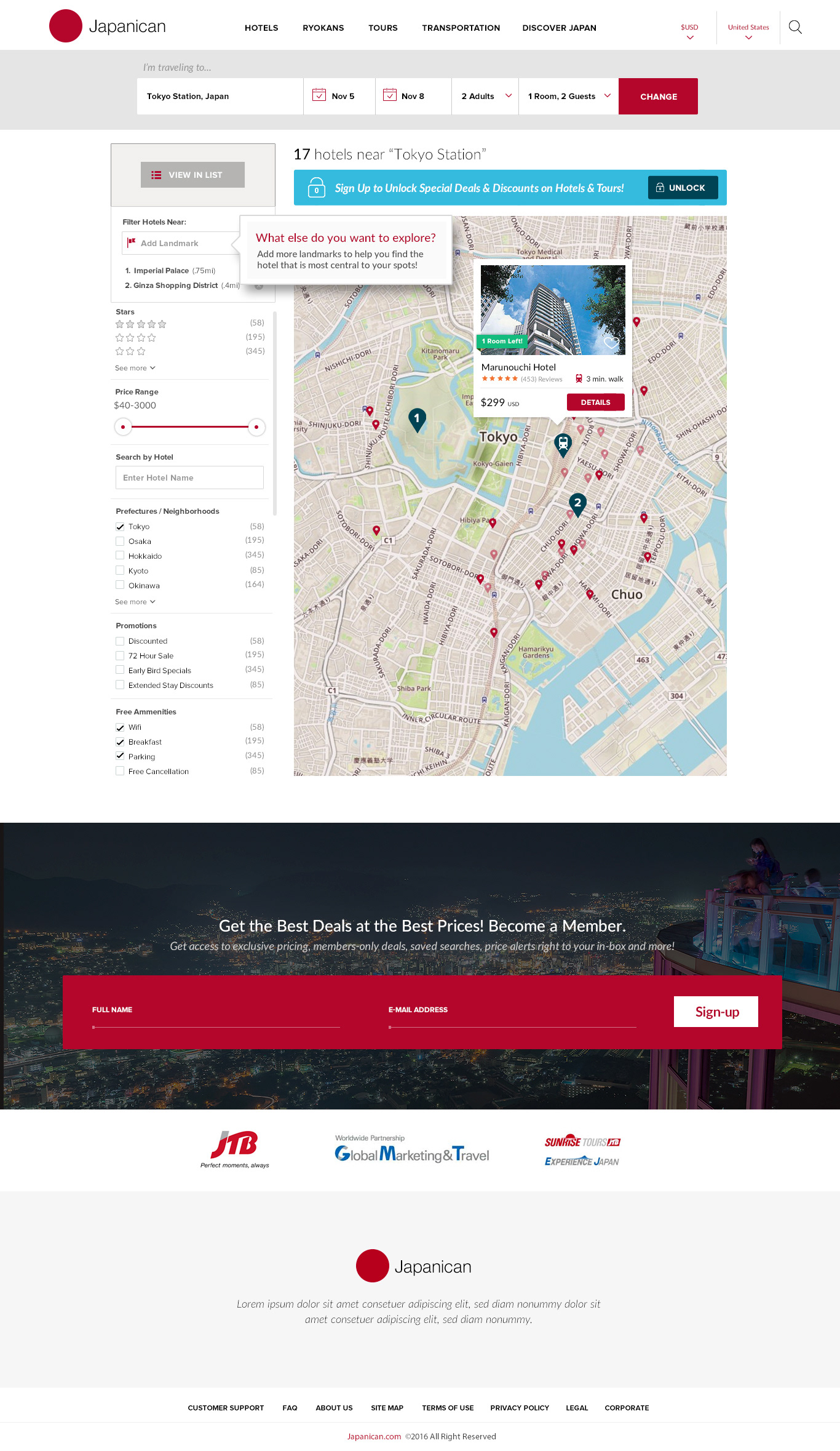
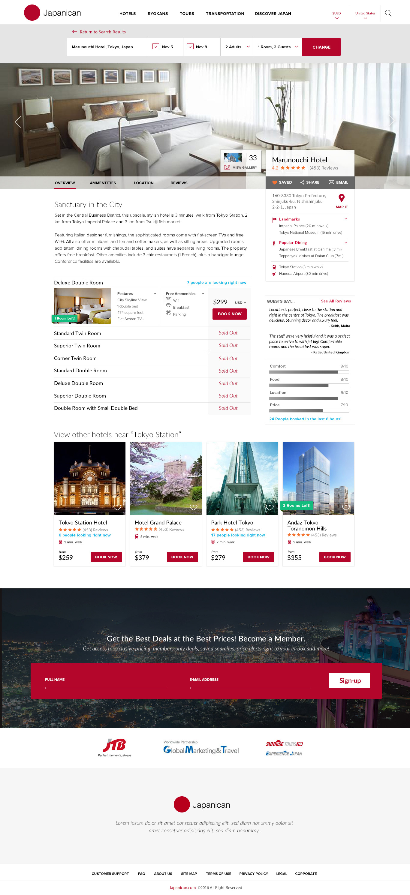
Utilizing the final sketches we had presented and received stakeholder agreements on, I began to build out high-fidelity prototypes that brought the sketches to life. The prototypes assimilated the vast majority of the previous month's work including research, testing, wire-framing and sketching and all the major pain points we'd uncovered were successfully addressed in these new designs including:
- New Smart Search
- New Information Architecture
- Improved design, imagery and content
- Well defined user paths to locating relevant content by interest
- Interactive filtering system for better defining search parameters
- Interactive maps
- New tool tips to help users
- Easy access to reviews and bookings
- Large, high-quality interior/exterior images for properties and details